Tendencias Muebles

A furniture retailer in Mexico was losing sales at the research stage. Customers found the product online but could not get enough information to commit, which sent them to the store or to a competitor. We redesigned the full e-commerce experience from scratch, grounded in stakeholder research, user interviews, and two rounds of usability testing.

COMPANY

Tendencias Muebles

Role

UX/UI Designer

Collaborator

Marta Valdes, Fatima Abel

COMPANY

Tendencias Muebles

Role

UX/UI Designer

Collaborator

Marta Valdes, Fatima Abel

COMPANY

Tendencias Muebles

Role

UX/UI Designer

Collaborator

Marta Valdes, Fatima Abel

AI image search

Designed around Pinterest-first search behaviour

AI room visualisation

Top feature for purchase confidence in testing

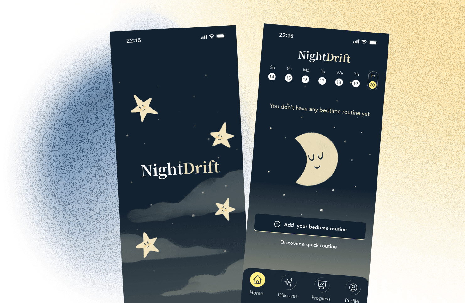
Full e-commerce redesign

From static catalogue to complete purchase flow

Overview

Overview

The problem the website was creating

Tendencias Muebles had been operating since 2001 and had a solid reputation in Xalapa, Veracruz, for modern furniture at competitive prices. Their physical stores performed well. Their website, launched in 2017 and largely unchanged since, was a different story.

In the stakeholder interview with the CEO, one thing came through clearly: most customers begin their journey online, even when they intend to buy in-store. The website was already part of the sales process, just not in a way that was helping. Missing prices, no dimensions, no reviews, no shopping cart. When a customer could not get the information they needed, the sale was either delayed or lost. As the CEO put it, 'if there are things you can't answer at that moment, the possibility of the sale is lost.'

The gap between the brand's premium positioning and the actual digital experience was significant. The challenge was not adding e-commerce to a catalogue. It was transforming the site into something that could genuinely support a high-consideration purchase decision.

The research

The research

What the research confirmed

We interviewed five users from Latin America who had experience buying furniture both locally and in Europe. The contrast was useful: it surfaced expectations shaped by more mature e-commerce markets and made the gaps in the current experience more visible.

The pattern across interviews was consistent. Furniture purchases are high-cost, long-term decisions where trust and clarity matter more than speed. Users relied heavily on reviews, particularly negative ones. They wanted multiple images from different angles, dimensions, materials, and context shots showing the furniture in a real space. Several mentioned using Pinterest as a starting point and then trying to find the same piece, or something similar, online.

That last behaviour pointed to something worth designing for: users were arriving with visual references, not product names. The search experience needed to account for that.

The process

Building the foundation that made iteration possible

The three of us covered research and conceptual phases collaboratively, with shared decisions on direction, persona, journey, and MVP scope. I led the low-fidelity prototyping and conducted one of the usability testing sessions independently. From mid-fidelity onwards, I led the Figma execution: setting up the grid system, defining the 8px spacing unit, establishing typographic styles, and building the component library that the team then used to work in parallel. Having that foundation in place early meant that iteration after each round of testing was significantly faster.

The solution

Key design decisions

The most important decision was treating the product detail page as the centre of the experience. That is where the sale is won or lost. We gave it clear hierarchy: primary images first, including context shots showing dimensions and the piece in a room, then pricing and key specs, then reviews with filter and sort options, then the AI room visualisation tool as a dedicated section rather than buried in an accordion.

The AI image search was a direct response to the Pinterest behaviour from research. Users could upload a reference image and get matching products from the catalogue. It addressed a real search pattern without requiring users to know product names or categories.

We also rebuilt the information architecture from scratch. The original sitemap followed the structure of a small standard shop. The redesigned version aligned more closely with industry conventions and supported the brand's actual product range and offline sales volume.

Testing

From the most confusing part to the most complete

We ran usability testing at low-fidelity and a second round at mid-fidelity, each with a clear focus: validate the structure first, then refine the details.

The low-fidelity round confirmed that the product detail page was where decisions happened and where the most work was needed. The mid-fidelity round, run with five participants, validated the restructured hierarchy and surfaced smaller friction points around payment reassurance, which we resolved before the final prototype.

By the end of the process, the product detail page had gone from the most confusing part of the experience to the most complete: clear hierarchy, visible reviews with filter options, contextual images with dimensions, and an AI visualisation tool that users found and understood without prompting.

Takeaway

What this project makes visible

Trust in a digital product is built through clarity, not through visual complexity. Every decision in this project came back to the same question: does this help the user feel informed enough to commit? The AI tools, the review system, the context photography, the dimensions; all of them exist to reduce a specific doubt at a specific moment in the journey.

Setting up the component system early was also a decision that compounded. It slowed us slightly at mid-fidelity and removed friction at every stage after that.

The process

Building the foundation that made iteration possible

The three of us covered research and conceptual phases collaboratively, with shared decisions on direction, persona, journey, and MVP scope. I led the low-fidelity prototyping and conducted one of the usability testing sessions independently. From mid-fidelity onwards, I led the Figma execution: setting up the grid system, defining the 8px spacing unit, establishing typographic styles, and building the component library that the team then used to work in parallel. Having that foundation in place early meant that iteration after each round of testing was significantly faster.

The solution

Key design decisions

The most important decision was treating the product detail page as the centre of the experience. That is where the sale is won or lost. We gave it clear hierarchy: primary images first, including context shots showing dimensions and the piece in a room, then pricing and key specs, then reviews with filter and sort options, then the AI room visualisation tool as a dedicated section rather than buried in an accordion.

The AI image search was a direct response to the Pinterest behaviour from research. Users could upload a reference image and get matching products from the catalogue. It addressed a real search pattern without requiring users to know product names or categories.

We also rebuilt the information architecture from scratch. The original sitemap followed the structure of a small standard shop. The redesigned version aligned more closely with industry conventions and supported the brand's actual product range and offline sales volume.

Testing

From the most confusing part to the most complete

We ran usability testing at low-fidelity and a second round at mid-fidelity, each with a clear focus: validate the structure first, then refine the details.

The low-fidelity round confirmed that the product detail page was where decisions happened and where the most work was needed. The mid-fidelity round, run with five participants, validated the restructured hierarchy and surfaced smaller friction points around payment reassurance, which we resolved before the final prototype.

By the end of the process, the product detail page had gone from the most confusing part of the experience to the most complete: clear hierarchy, visible reviews with filter options, contextual images with dimensions, and an AI visualisation tool that users found and understood without prompting.

Takeaway

What this project makes visible

Trust in a digital product is built through clarity, not through visual complexity. Every decision in this project came back to the same question: does this help the user feel informed enough to commit? The AI tools, the review system, the context photography, the dimensions; all of them exist to reduce a specific doubt at a specific moment in the journey.

Setting up the component system early was also a decision that compounded. It slowed us slightly at mid-fidelity and removed friction at every stage after that.