NightDrift

A gap no existing product was covering directly: not sleep tracking, not meditation, but the fragile transition between being awake and going to bed. NightDrift is a concept iOS app that supports pre-sleep routines for the moments when motivation runs out.

NightDrift

A gap no existing product was covering directly: not sleep tracking, not meditation, but the fragile transition between being awake and going to bed. NightDrift is a concept iOS app that supports pre-sleep routines for the moments when motivation runs out.

Role

UX/UI Designer

Collaborator

Marta Valdes

Role

UX/UI Designer

Collaborator

Marta Valdes

Role

UX/UI Designer

Collaborator

Marta Valdes

Market gap confirmed

No competitor addressed pre-sleep routine execution

Two interaction modes

Designed for high and low energy states before sleep

Desirability testing

Strong alignment with calm, comfort and helpfulness

The problem

The problem

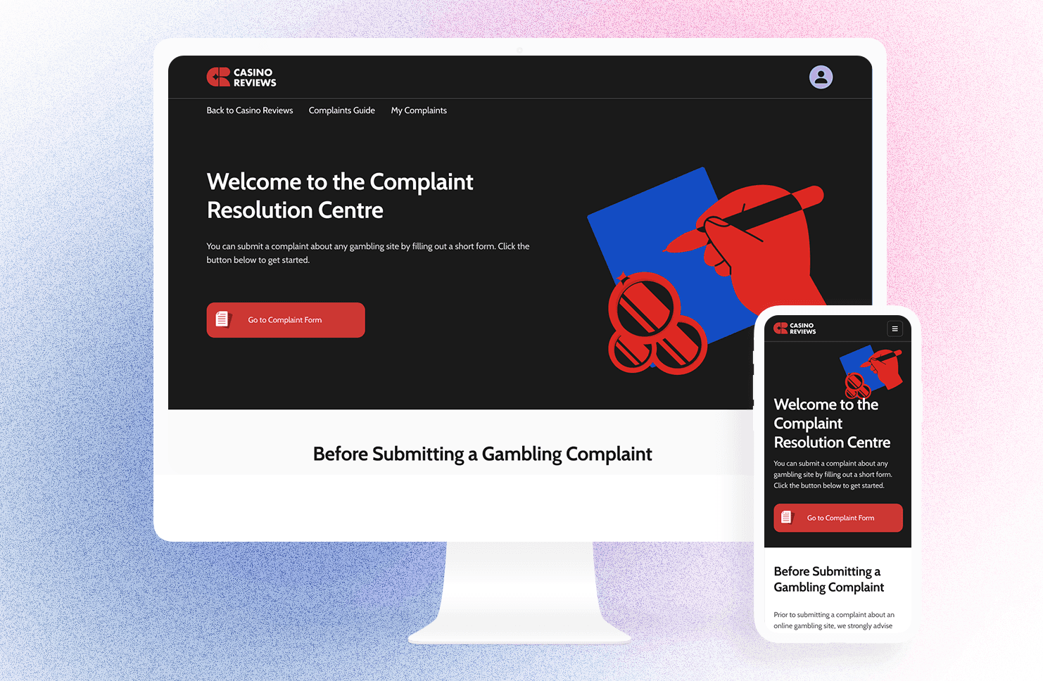
The problem worth designing for

Sleep is widely understood as essential. The products designed around it are mostly built around the same assumption: that users need more data, more insight, more coaching. Tracking apps measure what happened. Meditation apps help you wind down. None of them focused on the specific moment when the day is ending, energy is gone, and the intention to have a good night quietly dissolves into scrolling on the couch.

The competitive analysis confirmed this. Across the market, the pre-sleep window, the hour or two before sleep where behaviour actually determines rest quality, was largely unaddressed. That became the focus.

The research

The research

What the research showed

We combined a survey with user interviews and found a consistent pattern. People were not going to bed late because they did not know better. They were going to bed late because the transition from being awake to actually starting a bedtime routine required more energy than they had left.

Several participants described falling asleep unintentionally on the couch. Others used screens deliberately to unwind, knowing it was not ideal but finding it the path of least resistance. Small personal rituals, a shower, stretching, reading, existed but broke down after demanding days.

One distinction that came out of the research shaped the entire design direction: these users were exhausted but not asleep. They were in a state of low energy passive delay. The app needed to work with that state, not against it.

The process

How we worked

Marta and I divided the work to maintain pace. I led the competitive analysis, the persona, the initial user journey, and the HMW statements. Marta drafted the interview questions and led the visual direction and illustration. Key decisions on direction, MVP scope, and testing were made together.

From mid-fidelity onwards, I led the Figma execution: component structure, typographic scale, icon system as component variables, and animations and microinteractions in the final prototype. Working this way let us move in parallel while staying aligned.

The solution

Adapting to the energy available

NightDrift supports the pre-sleep routine by adapting to different levels of energy. On evenings when planning feels manageable, users can build a routine from familiar or custom habits. On nights when effort is limited, an AI routine generator creates one from a single goal and the time available.

Routines start with minimal setup and unfold step by step at the user's pace. Steps are optional, skipping never breaks the experience, and interaction works through touch or voice. The dashboard surfaces continuity lightly, showing patterns without turning them into performance metrics.

The visual language was a deliberate design decision. Most sleep apps use either serene light interfaces or dark backgrounds with saturated accents that increase stimulation. We avoided both. NightDrift uses a dark palette softened with low-light tones and restrained accents, calm, cosy, and ritualistic without being clinical.

Testing

What testing showed

We ran concept testing at low-fidelity and two rounds of usability testing at mid-fidelity. The first round identified that having manual and guided routine modes on the same screen was confusing and the wording was not strong enough to differentiate them.

We redesigned that experience entirely before the second round. The separation between modes became cleaner, the entry points more distinct, and the language more direct. The final round produced limited feedback, mostly small interaction improvements, and the core concept was much clearer.

Desirability testing showed strong alignment with calm, comfort, and helpfulness across participants, with users intentionally avoiding stimulating or high-energy traits in their responses.

Takeaway

What this process made clear

Evening routines break down when they feel all or nothing. The design had to support imperfection without making users feel they had failed. That shaped everything: the optional steps, the skip without penalty mechanic, the continuity framing in the dashboard over streak-based tracking. The result is a product that treats an imperfect night as a normal night, not a missed one.

The process

How we worked

Marta and I divided the work to maintain pace. I led the competitive analysis, the persona, the initial user journey, and the HMW statements. Marta drafted the interview questions and led the visual direction and illustration. Key decisions on direction, MVP scope, and testing were made together.

From mid-fidelity onwards, I led the Figma execution: component structure, typographic scale, icon system as component variables, and animations and microinteractions in the final prototype. Working this way let us move in parallel while staying aligned.

The solution

Adapting to the energy available

NightDrift supports the pre-sleep routine by adapting to different levels of energy. On evenings when planning feels manageable, users can build a routine from familiar or custom habits. On nights when effort is limited, an AI routine generator creates one from a single goal and the time available.

Routines start with minimal setup and unfold step by step at the user's pace. Steps are optional, skipping never breaks the experience, and interaction works through touch or voice. The dashboard surfaces continuity lightly, showing patterns without turning them into performance metrics.

The visual language was a deliberate design decision. Most sleep apps use either serene light interfaces or dark backgrounds with saturated accents that increase stimulation. We avoided both. NightDrift uses a dark palette softened with low-light tones and restrained accents, calm, cosy, and ritualistic without being clinical.

Testing

What testing showed

We ran concept testing at low-fidelity and two rounds of usability testing at mid-fidelity. The first round identified that having manual and guided routine modes on the same screen was confusing and the wording was not strong enough to differentiate them.

We redesigned that experience entirely before the second round. The separation between modes became cleaner, the entry points more distinct, and the language more direct. The final round produced limited feedback, mostly small interaction improvements, and the core concept was much clearer.

Desirability testing showed strong alignment with calm, comfort, and helpfulness across participants, with users intentionally avoiding stimulating or high-energy traits in their responses.

Takeaway

What this process made clear

Evening routines break down when they feel all or nothing. The design had to support imperfection without making users feel they had failed. That shaped everything: the optional steps, the skip without penalty mechanic, the continuity framing in the dashboard over streak-based tracking. The result is a product that treats an imperfect night as a normal night, not a missed one.