Spotahome
Rental platforms have not fundamentally changed how people search. Spotahome wanted to explore what that experience could look like if AI were central to it, not added on top.
Spotahome
Rental platforms have not fundamentally changed how people search. Spotahome wanted to explore what that experience could look like if AI were central to it, not added on top.
COMPANY
Spotahome
Role
UX/UI Designer
Collaborator
Fatima Abel
COMPANY
Spotahome
Role
UX/UI Designer
Collaborator
Fatima Abel
COMPANY
Spotahome
Role
UX/UI Designer
Collaborator
Fatima Abel

Decision support
From browsing to confident commitment
AI lifestyle matching
Compatibility scores replace manual filtering
Privacy first flatmate interaction
Profiles reveal only when both sides choose to connect
The brief
The brief
A platform built around a decision users make without full information
Spotahome is built around a premise that creates real tension: users commit to accommodation they have never visited, with people they have never met, in cities they may not know. The platform handles the logistics of remote rental well. The question they brought to us was different: could AI change not just how listings are presented, but how users move from browsing to deciding?

The context
The context
Why Gen Z, and why now
The brief identified Gen Z as the primary audience. The secondary research supported that framing on structural grounds.
Renting has become the dominant housing path for a generation that is not choosing it by preference but by economic constraint. Gen Z is already Spotahome's core user base, and urban rental demand from this cohort is projected to grow substantially through the early 2030s as they enter and move through the workforce. The platform that earns their trust now is the platform they return to when they relocate for a first job or a second city.
They also search, evaluate, and decide differently. They expect platforms to do the analytical work for them. Filters and manual comparison feel like friction, not features. Designing for that expectation was not a concession to the brief. It was the clearest path to building something relevant.

The research
We ran 115 surveys, 88% from our target audience, and seven user interviews, all with Gen Z users who had searched for accommodation remotely. The pattern that came back was consistent.
Users were not asking for more listings. They wanted to understand the ones they already had: who the flatmates actually were, not a headcount but something closer to a person; what the neighbourhood felt like at night, not just where it sat on a map. Several described wanting the platform to surface what matched their lifestyle rather than requiring them to filter and compare manually.
The problem was not access to listings. It was the absence of support at the moment of deciding.


The process
Dividing execution while keeping decisions joint
Fatima and I divided research and design work to maintain pace across the two-week sprint, while keeping all key decisions collaborative. I led the brand and feature analysis at the start, reconstructed Spotahome's design system from scratch during mid-fidelity, and took primary responsibility for animations, microinteractions, and the onboarding flow. Fatima led the brand positioning map, survey, and the comparator solution. We reviewed each other's work continuously and made decisions on direction, MVP scope, and testing priorities together.
Reconstructing the design system took a full day. The client did not share any design assets, so I worked from the live product: inspecting grids and layouts, extracting type styles, and downloading SVGs via browser extension. Once the styles were in place, iteration after each round of testing became significantly faster.
The solution
Inverting the analytical work
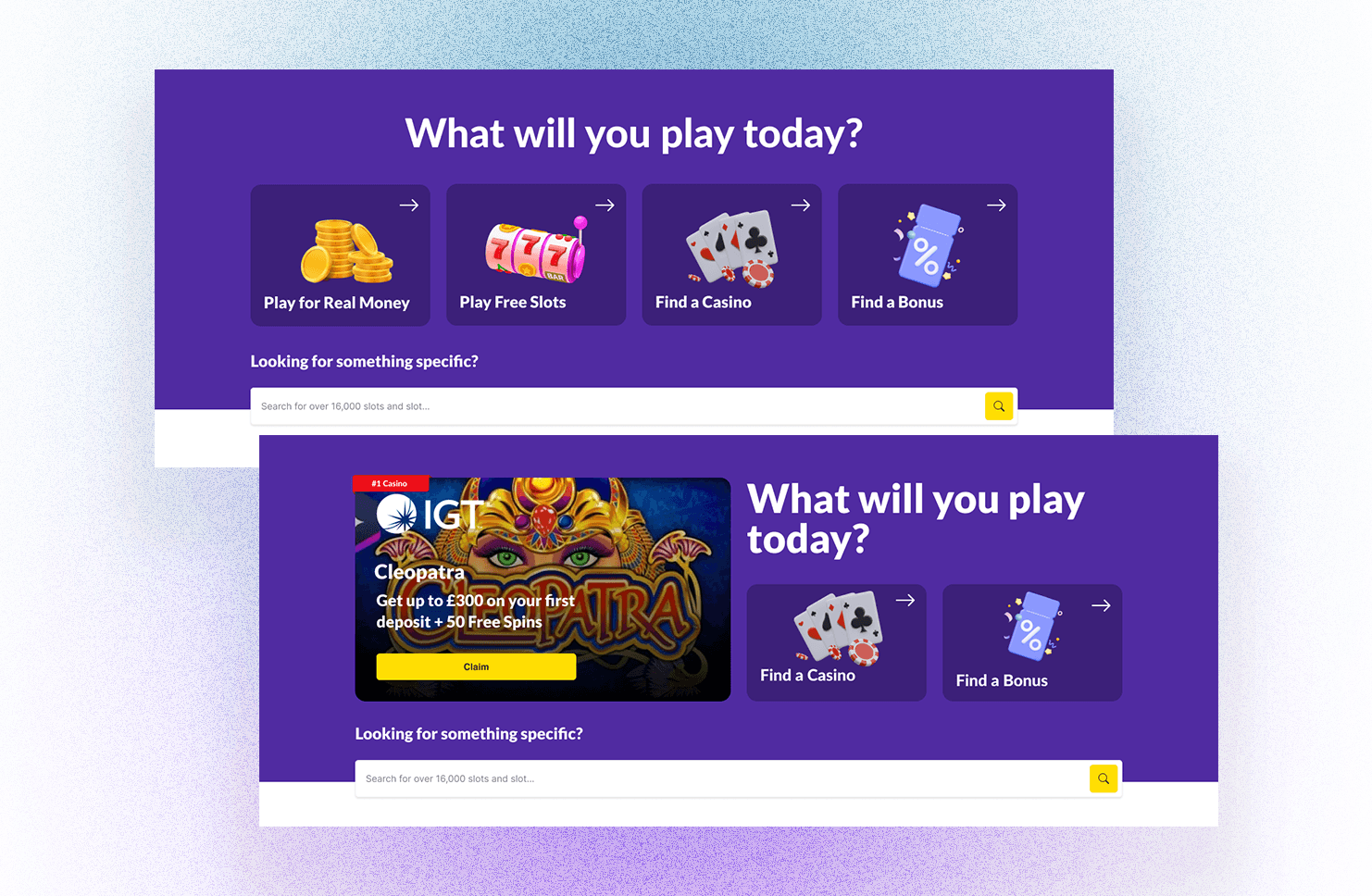
Most rental platforms ask users to do the analytical work: browse, filter, compare, decide. The concept we built inverts that.
Users complete a guided onboarding that captures living preferences, budget, and constraints. This generates a compatibility score for each listing. Results are presented as a ranked set of options, each with a short explanation of why it fits: budget, distance, house rules, flatmate compatibility.
The flatmate interaction was one of the more considered parts of the design. Partial profiles are visible before contact is initiated. Communication unlocks only when both sides choose to share more. The mutual reveal mechanic came directly from research, where users wanted to know who they were committing to without feeling exposed in the process.


Testing
Each round brought the concept closer to feeling genuinely useful
We ran concept testing in low-fidelity and two rounds of usability testing, one at mid-fidelity and one at high-fidelity. The most consequential shifts between rounds were around clarity and trust: making price visible at the comparison stage, sharpening the entry point to the matching feature so users understood it as central rather than optional, and refining how the flatmate privacy mechanic was introduced so its purpose was clear before users had to commit to it.
By the final round, feedback was limited to small interaction improvements. The core concept was understood, the flow felt coherent, and the matching experience landed as intended.


Takeaway
A different contract between the user and the product
Designing for Gen Z renters shaped how we approached information density and friction from the start. Research confirmed that this cohort expects a product to surface what is relevant, explain it quickly, and remove itself from the process. That expectation drives decisions from how much onboarding is acceptable to how listing information needs to be structured.
Working at speed across a two-week sprint reinforced something about collaborative process: dividing execution while keeping decisions joint is what allowed us to move fast without losing alignment.
The research
We ran 115 surveys, 88% from our target audience, and seven user interviews, all with Gen Z users who had searched for accommodation remotely. The pattern that came back was consistent.
Users were not asking for more listings. They wanted to understand the ones they already had: who the flatmates actually were, not a headcount but something closer to a person; what the neighbourhood felt like at night, not just where it sat on a map. Several described wanting the platform to surface what matched their lifestyle rather than requiring them to filter and compare manually.
The problem was not access to listings. It was the absence of support at the moment of deciding.
The process
Dividing execution while keeping decisions joint
Fatima and I divided research and design work to maintain pace across the two-week sprint, while keeping all key decisions collaborative. I led the brand and feature analysis at the start, reconstructed Spotahome's design system from scratch during mid-fidelity, and took primary responsibility for animations, microinteractions, and the onboarding flow. Fatima led the brand positioning map, survey, and the comparator solution. We reviewed each other's work continuously and made decisions on direction, MVP scope, and testing priorities together.
Reconstructing the design system took a full day. The client did not share any design assets, so I worked from the live product: inspecting grids and layouts, extracting type styles, and downloading SVGs via browser extension. Once the styles were in place, iteration after each round of testing became significantly faster.
The solution
Inverting the analytical work
Most rental platforms ask users to do the analytical work: browse, filter, compare, decide. The concept we built inverts that.
Users complete a guided onboarding that captures living preferences, budget, and constraints. This generates a compatibility score for each listing. Results are presented as a ranked set of options, each with a short explanation of why it fits: budget, distance, house rules, flatmate compatibility.
The flatmate interaction was one of the more considered parts of the design. Partial profiles are visible before contact is initiated. Communication unlocks only when both sides choose to share more. The mutual reveal mechanic came directly from research, where users wanted to know who they were committing to without feeling exposed in the process.
Testing
Each round brought the concept closer to feeling genuinely useful
We ran concept testing in low-fidelity and two rounds of usability testing, one at mid-fidelity and one at high-fidelity. The most consequential shifts between rounds were around clarity and trust: making price visible at the comparison stage, sharpening the entry point to the matching feature so users understood it as central rather than optional, and refining how the flatmate privacy mechanic was introduced so its purpose was clear before users had to commit to it.
By the final round, feedback was limited to small interaction improvements. The core concept was understood, the flow felt coherent, and the matching experience landed as intended.
Takeaway
A different contract between the user and the product
Designing for Gen Z renters shaped how we approached information density and friction from the start. Research confirmed that this cohort expects a product to surface what is relevant, explain it quickly, and remove itself from the process. That expectation drives decisions from how much onboarding is acceptable to how listing information needs to be structured.
Working at speed across a two-week sprint reinforced something about collaborative process: dividing execution while keeping decisions joint is what allowed us to move fast without losing alignment.